Page 1 of 3
2006 Logo?
Posted: Fri Jun 16, 2006 10:05 pm
by Weehawk
New logo for 2006 under construction.
Back to
http://www.thelogocompany.com
They've doubled their price since last year, but at $150 it's still a very reasonable price for such a service.
The six prospective candidates offered me based on my original parameters:
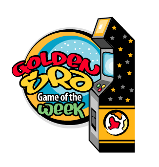
Design 1:
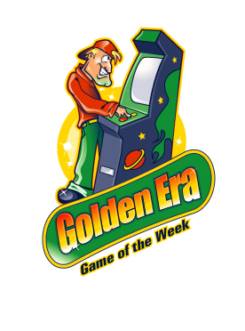
Design 2:
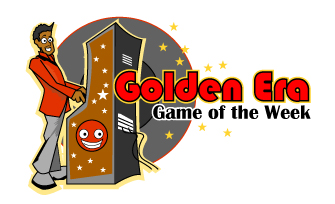
Design 3:
Design 4:
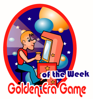
Design 5:
Design 6:
No, you don't get any say in which one I choose.
But...
I still have a bunch of GEGOTW 2005 t-shirts to get rid of:


So, for any person who:
1) Has ever submitted a recording for the Game of the Week the last two years
and
2) Has NOT previously received a GEGOTW t-shirt
and
3) Can respond to this post correctly guessing which of the six concepts above I have chosen to have developed for the new logo
I will send a GEGOTW 2005 shirt in M, L, or XL while supply lasts. Quick count looks like I have 4 Medium, 8 Large, and 10 Xtra Large left.
You have 48 hours.
Posted: Fri Jun 16, 2006 11:26 pm
by The TJT
No guesses here, but design 2 guy wears his hat wrong way for the 80's!
Posted: Fri Jun 16, 2006 11:50 pm
by TRB_MetroidTeam
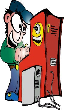
Firstly I thought the "3" was the one, but it is the unique that show the back part of the cabinet, so... we don't know if this is an arcade, and piano, or a "money-hunting" machine.
So, I think your choice is the design "2" too.
Posted: Sat Jun 17, 2006 12:18 am
by MJS
I'm guessing #2
Posted: Sat Jun 17, 2006 8:07 am
by sawys
I think Design 1 which appeared to be the most serious for me
Posted: Sat Jun 17, 2006 8:26 am
by BBH
I'm also guessing #1.
Posted: Sat Jun 17, 2006 11:31 am
by pat33999
I'm guessing Design 1. The rest of them look very strange to me, mainly because of the wierd looking cartoon characters.
Posted: Sat Jun 17, 2006 5:47 pm
by welby1
Ok, I think 1 is the best of the lot here. None of the above would be my guess, for $150; they seem hurried. I'm surprised you didn't just have an open submission competition. With a prize of even $100, you'd get tons of quality responses.
I guess 1
Posted: Sat Jun 17, 2006 9:03 pm
by Koza
I'd say that the first one is the best you could have chosen... the second one is too modern to me... like mentioned before, we can't identify the cabinet in the third logo... number four looks a little weird, don't know whats wrong with it, something's not right... design number 5 looks nice, but again - there's something just wrong with it... design six is the worst from all of the shown above, the cabinet and the player look like they are very close friends


Posted: Sun Jun 18, 2006 2:31 am
by Marco Marocco
number one
Posted: Sun Jun 18, 2006 10:14 pm
by Weehawk
Looks like I have a couple of t-shirts headed for South America.
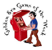
I wanted something this year a little more obviously in an arcade theme. I imagined some wild character playing an arcade machine. Maybe even a wacky creature like in the old "odd rod" stickers I collected as a kid:

Well, maybe not quite
that wild, but something like that playing an arcade game.
The closest thing I found existing on the web with a quick search was this:
which I actually showed to the logo people when I made my request. I told them I wanted something that sort of that flavor with more of an angle from the front of the machine, and to work in the "Golden Era Game of the Week" above/below/around it somehow.
That's about all I gave them to work with and three days later they offer these six (they only gurantee three) concepts to choose from to go forward with.
My take on the designs offered, saving the winner for last:
Design 1: Well, no character in it, but hey, it's a bonus anyway. I actually sort of like it okay, but like I said I wanted someone/something
playing the game.
Design 3: We're behind the machine again, and the guy is too damn nerdy looking. It also stretches out horizontally too much.
Design 4: No offense to homosexuals, but damn that looks gay.
Design 5: Overall not far off, but the machine is too straight-edged and boxy. The guy is also not quite right. And that hat...
Design 6: Getting a little further from what I had in mind. Is that machine smiling?
Design 2: Much more what I had in mind. I can work with this. I suggested some color alterations, told them to lose the hat (baseball hats aren't cool, no matter how you wear them), and it's a little weird how he's so still and touching the machine with one finger. I told them to make him gripping a joystick instead.
With some alterations I think I'll like it.
Anyway, MJS and Valter, let me know your mailing addresses and shirt sizes.
Posted: Sun Jun 18, 2006 11:09 pm
by BBH
Weehawk wrote:Design 4: No offense to homosexuals, but damn that looks gay.
Posted: Sun Jun 18, 2006 11:33 pm
by Weehawk
BBH wrote:
Note to hopefuls who piss me off in any way:
Alternate versions of the shirt could be produced....

Posted: Mon Jun 19, 2006 12:19 am
by TRB_MetroidTeam
Thank you John!
lol
Posted: Mon Jun 19, 2006 12:23 am
by MJS
PM sent.
Long live GEGOTW!
